Equal Area Map
Written by kris & katie on October 2, 2007. Permalink
Most of us could probably use a good look at this map- or at least post it up somewhere prominent to remind ourselves that there are many other places in the world. Not trying to be philosophical here, just suggesting some perspective.
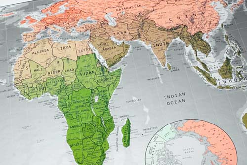
“This map doesn’t just look good, it also serves a useful purpose. It is an Equal Area Projection, meaning that all countries are in correct proportion to one another in terms of size. This is rare in global mapping: maps generally illustrate their “mother” country as disproportionately large. Available in two versions. Version 1: yellow to red to purple and Version 2: (limited edition) green to salmon to brown.”


