skip to main content


Inspiration

Inspiration- Stairs with Glass Banister

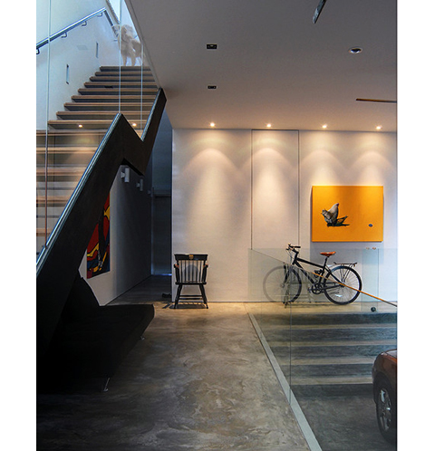
Hmm… concrete plus glass usually means cold (not brrr-cold, more like cold-museum-looking), but this stairway/entrance (garage?) has been in my inspiration files for a while. Knocking down a regular banister in favor of a glass one *wall* like this would sure let a lot more light bounce around, not to mention pare down any visual clutter. Of course, the artwork, bike, and chair helps this space to feel lived in… it might veer towards the uncomfortable-museum-look without them.

Image from Aun and Su-Lyn’s home on Design*Sponge.

*Thanks Joe

Source: AT
HOUSE MILCAMPS

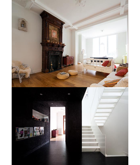
Yes, these two photos are of the same house. Does that blow your mind, because it sure did mine. If you want your head to properly and majestically explode, take a look at the following photos. Freaking A-maz-ing.

All photos, Tim Van De Velde.

(more…)

More information:

View HOUSE MILCAMPS here

Source: OWI

Yellow!

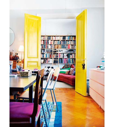
Most of us aren’t really fans of yellow, are we? I know I’m not, but this image of bright yellow doors has been in my inspiration files as a reminder of the possibility of maybe painting something yellow. Can you imagine? It would be a jolt, wouldn’t it… like somebody hitting you over the head with a baseball bat (a nice, sunshiny one) every time you walk past it.

Didn’t look long enough to see if I could find other pics of the same interior, so if you find some, please let me know.

More information:

View Yellow! here

Source: ELLE Interior

Anita Calero’s Loft

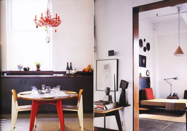
I’ve been seeing some of these shots around on other blogs and it reminded me of the story I initially saw on LoftLife. Often I veer towards a minimal aesthetic, where I’ll pack away all the knicknacks and thingamajigs I’ve acquired over the years, only to run across photos like these which remind me of how nice a home is when it tells a story. I mean that in a ‘collect-stuff-that-you-love’ sort of way, not in an ‘I-hired-a-designer’ sort of way, does that make sense? I think sometimes it’s hard to tell in interiors magazines which way that pendulum swings, but in the case of Anita Calero’s loft, it just seems obvious that it’s all her. Her stuff, her likes, her collections. (Watch someone tell me she hired a designer.)

That’s enough of my rambling. Click ‘Read More’ for more photos (and a little more rambling).

(more…)

Inspiration: Kitchen cabinets

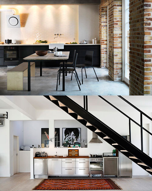
These two kitchens (shot by Stuart McIntyre) are entirely tempting to put into my future kitchen renovation file. However, the lack of upper cabinets seems sort of… scary. I know it’s quite a popular option, as it opens up the room and allows display of dinner and glass ware, but losing all that storage space seems risky. I love the way it looks, but I’ll have to think of alternate storage options if I go that route, as I have very little lower cabinet storage space.

Inspiration: Carter Smith’s Home

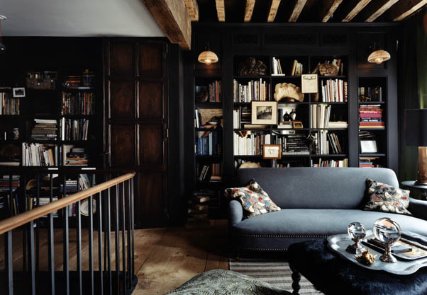
Running across this photo from the January 2007 issue of House & Garden (via moodboard) made me look a little more at the details within the room. I’m not one for overstyling bookcases, but something about the haphazardness of these is really appealing, because, uh, oh yeah, they don’t look styled. I might try paying a little more attention to my own study bookcases… goodness knows they need some love.

also his brick and wooden beam bathroom (via Habituallly Chic) is just not fair:
carter-smith-jan-2007-house-garden-17.jpg

Oktavilla / Elding Oscarson

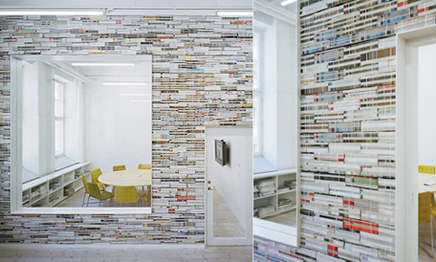
Magazines as wall material! Such a great idea. Check out the rest of the project via ArchDaily.

“Besides having a literal relevance to the client’s business, the wall made of stacked bundles of magazines is not only a natural conversation piece in its mere irrationality, but also works as an acoustical absorbent.” -ArchDaily

Architect: Elding Oscarson

Inspiration: Small Tile Everywhere

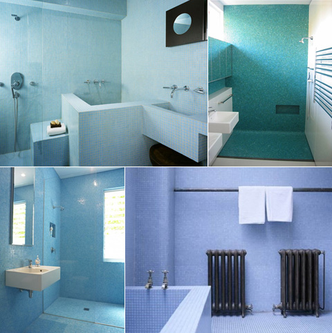
Here’s a small grouping of bathroom photos with aqua/blue small tile used (almost) everywhere. I love the way it looks, but would you get tired of all that color after a while?

top left: AT: Kimberly’s Loft
top right: Scott Weston Archtecture*Design
bottom left: Scott Weston Archtecture*Design
bottom right: Beach Studios

Fernlund & Logan Loft

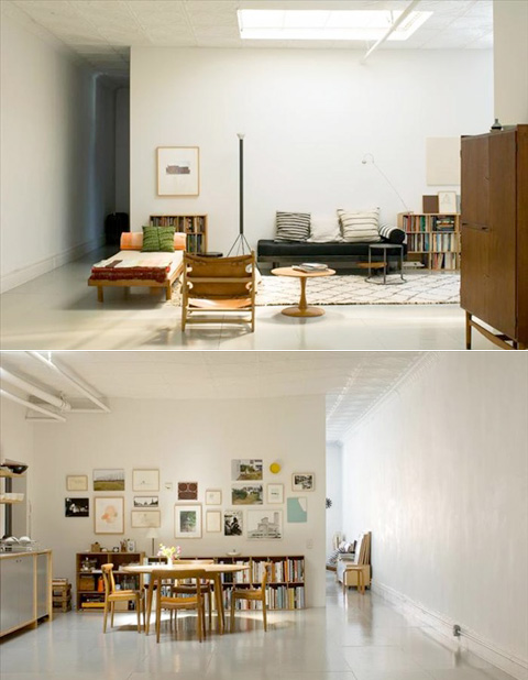
Remember this wall art I posted a while ago? Well, that particular interior was bugging me, because I thought I saw it somewhere before. And BAM! Today I saw it over on LoftLife. So much freaking white space, it’s almost not fair. If I lived there, those glossy grey floors would be treated to my rollerskates all the time.

Inspiration: Black Glossy Floors

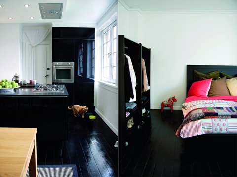
More proof that black isn’t going anywhere. I wish I would stop finding pictures of glorious black shiny floors, because it makes me itch to paint my own hardwood floors (that have absolutely nothing wrong with them).

[via BOLIG Magasinet]

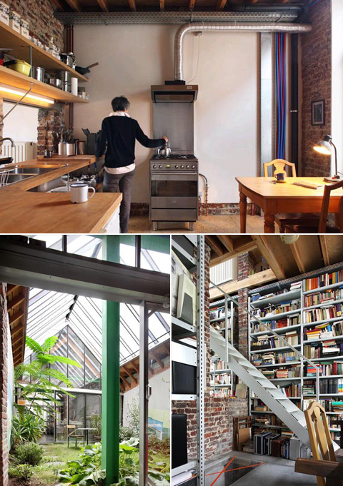
House 43, photos Dujardin Filip

OWI is a treasure trove of homes to break my heart against, I swear. This strange one has all sorts of odd choices, but the end result is honest and comfortable. Things to pay attention to: the unassuming facade, the atrium with retractable roof (of course), the staircase through the brick wall and the small glass floor portion below (shown lower right), huge metal bookcases filled to the brim, the lack of ‘finish’ to the ceilings, and about ten other things that I won’t list. It’s like a person you meet that seems sort of boring until you discover they are absolutely fascinating.

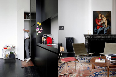
Apartment FH, photos Vercruysse Frederik

Remember the post from a while ago, with me talking about how it was one of my favorite spaces? Well, color me happy, because I found more shots of it on OWI. That’s right, it sure is freaking awesome. You better be glad I can restrain myself, otherwise you’d get all 20 photos right here, right now.

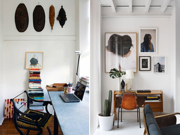
Inspiration: Workspace Vignettes

Often I’m tempted to fill my all walls with art and photos jammed all together, but these two smaller workspace shots that I ran across yesterday remind me that sometimes simple editing and a little breathing room can make much more of an impact.

On left: Nicola Finetti’s home
On right: Delfin-Postigo house

Inspiration: Bathroom (Showdown)

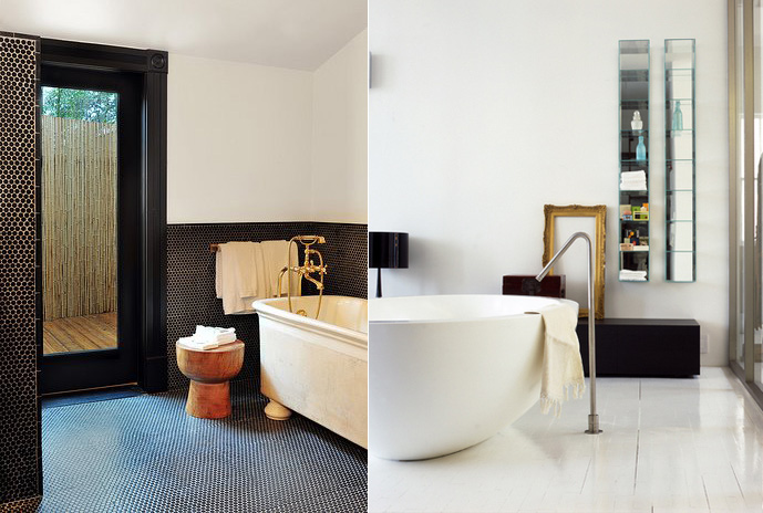
I’m planning on updating our bathroom once we eventually move back to the US, and so far these two photos top the list of my starting reference point. I’ve always like the penny tile (especially dark like on the left) but there’s something incredibly clean and refreshing about all white bathrooms. Hmm, which direction to go…

Inspiration: Picture Frame Collection

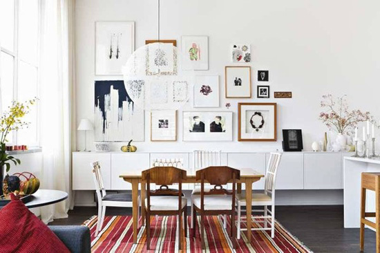
I love the how the art display in this room adds interest to a section of (what looks to be) a huge white wall. The low cabinet running the length of the room also helps to anchor and focus the eye as well. (Lighting fixture: Random Light)