Bathroom Inspiration at Door 16
Written by Kris on February 25, 2009. Permalink
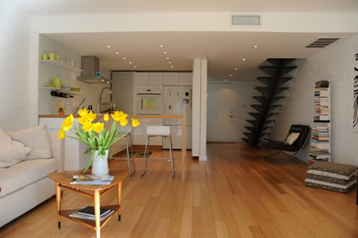
If you’ve been following the remodel section, you know that I’m currently remodeling an old home. Due to budget constraints, that means lots of waiting and obsessing on the internet trying to find solutions. Ordinarily, I would know exactly how to do the remodel, but in this case, my home is an old California Craftsman, and I’m not really sure how to honor the old structure while updating it. Basically, I don’t have enough experience with the style to know how to proceed.
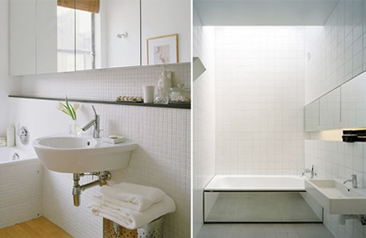
One salvation for me has been Door 16. While her home is a Victorian and the styles are somewhat different, some of the updates she is doing would actually work quite well in a Craftsman.
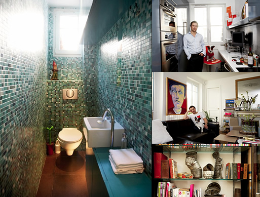
These are some bathrooms she posted late last year for inspiration and I’m thinking these style might work in my home.
[posted by kris]
More information:
View Bathroom Inspiration at Door 16 here