skip to main content


Architecture-Design

Casa Blair Road by Ong & Ong

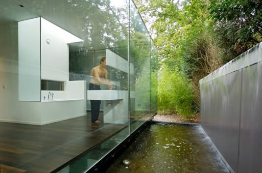
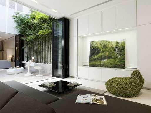
I’m currently in the planning stages of working on the landscape on my home, and since I’m in Southern California, I’m lucky enough to have nice weather almost year round, so one thing I’m striving for is a way to have indoor spaces which can easily transition to outdoor. I’m loving the Casa Blair Road house by Ong & Ong, which is simply stunning. The outdoor space feels like an extension of the home, and conversely, the transitional room feels like it’s outside.

[posted by kris]

Cinco Camp, Roger Black’s Texas retreat

NYTimes.com recently ran an article entitled Self-Contained in Texas which shows Roger Black’s Texas retreat. Made of five 8-by-20-foot containers, each one houses its own particular function and is joined by a walkway with a small deck and integrated grill.

“The opening on each compartment is fitted with sliding glass doors and screens to keep out stinging, biting and otherwise menacing creatures, and the rooms all face west so Mr. Black and any guests can watch the spectacular sunsets as well as distant locomotives toting the same kinds of shipping containers used in the home’s construction.” –By Kate Murphy

See NYTimes article for more.
All photos by James H. Evans for The New York Times

Matsudo Mansion by Bakoko Design and Development

The owners of Bakoko Design and Development recently undertook remodeling their post-war Japanese apartment down to painstaking detail. Walls were removed to create more of an open living plan and little gems of usability are hidden throughout the apartment. My favorite is the shock of pink on the walls hidden in the work compartment. I also really like the small vanity seen here.

[posted by kris]

London Urchin’s Fold-Out Jewel Box

300 square feet seems incredibly small, but the way this tiny studio is arranged it seems three times as big. The kitchen is especially notable, as doors unfold to reveal hidden compartments and storage space, as well as a sliding counter that extends for food preparation. The bright blue on the interior kitchen area is an incredibly smart touch, as it adds to the whole jewelry box concept.

“My studio has been transformed into a flexible living space which allows me to work, sleep, eat, and relax within the confines of 300 square feet…The concept of a jewelry box has been expanded so that the space can be transformed through pushing, pulling, sliding, opening and closing of individual elements of the cabinetry. The rubber floor creates a seamless look that leads one’s gaze through the windows into the garden square below. I have a hidden stairway and secret compartment. I think it rocks. I am now broke. –Mia, the London Urchin via AT

architect: Jennifer Beningfield of Open Studio Architects (more photos and project description shown here.)

for more photos and the complete posting go here.
[via AT]

Shoreditch Prototype House

If you are building or remodeling a house, you might consider incorporating vertical planting to provide shade in the warmer months. As this project by Cox Bulleid Architects shows, you don’t need a lot of land to have a good amount of greenery, though it should be said to take care in making sure there are structural supports for any weight of large screens/mesh with plantings and soil.

The project has been developed as a prototype low energy house for dense urban sites and seeks to green the city through the use of vertical planting as screen, filter, sunshade and oxygenator to create a new ‘garden city’ in an urban context…Bolted on steel decks provide balconies and privacy screens while planting grown over the mesh gives shade in summer and allows direct solar heating in winter. – Cox Bulleid Architects

See it here.

[via Grand Designs]

Writer’s Studio (Ghent, NY)

I think I would be inspired to write something too if I had this for a studio, even if it was only just ‘how freaking awesome is this house’ over and over again. Check out residential architect online for product specifications and credits.

A dark, quiet, enigmatic shape in the woods, this building responds to a very simple program. “It’s mostly about reading and writing, watching the fire, and listening to music,” says Wendy Evans Joseph, FAIA, LEED AP. But in simplicity there is power, and Joseph’s distilled forms and highly tuned surfaces imbue familiar elements with iconic force. Our judges noted the deft handling of walnut in building assemblies and sculptural custom furnishings. -(bruce d. snider)

[via residential architect magazine]

See it here.

Loft (Qb3 Design)

How many of you could be okay with open cabinetry in your kitchen? This photo of Frank and Ditta Hoeber’s Philadelphia loft sure makes it tempting, doesn’t it? Check out the spread from LoftLife Magazine for more inspiration.

Frank and Ditta Hoeber’s Philadelphia loft is all about display. The architectural and design firm behind the space, Qb3 Design, wanted to create a “silent background” within which the couple could feature their book collection, art and objects.

See it here.

Muennig’s Cooper Point Home

Wall Street Journal’s Magazine has a great article on eco-architect Micky Muennig’s Cooper Point Home. Take a look.

This house on Cooper Point, with its budding roof of wild grasses and California poppies, is one of his most impressive projects yet. It’s part of an expansive garden that, theoretically, stretches all the way down to the Pacific Ocean. Part hobbit hole, part high-tech habitat, it’s a perfect blend of old hippie values and the newest in green thinking. “The lifestyle was what really drew me here,” Muennig says. “I always dreamt of living freely in a small cabin.” –WSJ. Magazine

[via designboom]

Martin Swatton Remodel

For anyone who’s in the middle of remodeling, or embarking on a huge remodeling project, it might do you good to see this before and after for inspiration (and hope). It’s pretty amazing how huge the transformation is (I don’t even want to know how much it cost or how long it took)…it’s also for sale in case there are any interested parties out there.

visit martinswatton.com
more photos: livingetc.

Dollahite House

If you’re into the real estate market in Austin, you might be interested to know the Dollahite house is on the market. Featured in Dwell a while back, it’s an excellent example of how a teardown house can be salvaged back to life with impressive results. (Particularly interesting to me is the simple modern landscaping (as shown top right)…mostly how it’s been added to/matured since the first photo was taken.)

To see the listing, go here.

To see Blake Dollahite’s work and the house in detail, go here.
[via materialicious]

Loft, Renwick Street, New York

You know, renovating is no big deal. For example, if you need more space, why not just combine two whole floors of a building? It probably doesn’t take a lot of time or money…right?

All kidding aside, the gigantic windows are pretty amazing, and I like the choice of keeping the materials relatively simple and spare so that the space remains visually open and airy. The concrete floors give a nice history and sheen, although I’m starting to wonder about the heating bills in a place this size…with those windows…though I guess if you can afford to have a place like this, heating bills aren’t such a worry.

Two adjacent floors of a former factory were joined by removing a quadrant of the floor area between them, creating a double-height space that links all parts of the loft. A large, new opening in the exterior wall replaced two rows of existing windows. Industrial steel sashes were used to break down the scale of the opening and to reference neighboring natural-light factories. Public areas on the lower level utilize a concrete floor—a nod to the building’s past— while wide-board oak was used for the stairs and upstairs bedrooms. The building’s rough textured columns and beams became a counterpoint to the smooth surfaces of the new walls.

[via LoftLife Magazine]

to see more: fernlund + logan architects

Private Residence by Odos Architects

Wow. Look at how this home’s outside wall curves alongside the street perfectly…and how the wooden entrance provides such a nice warm contrast against the dark facade with only one large window at the edge facing the street. Lovely.

Project Info:
The design and aesthetic of this private residence is a reflection of both it’s semi-industrial context and the particular geometry of the site. The two-storey element of the building was partially sunk below ground level, with the resulting change in level being utilised in section to create complex relationships between the living volumes and external spaces.

[via materialicious]

to see more: ODOS architects

Fold away tables

This apartment located in New York has a smart solution for keeping clutter at bay: both tables shown above fold away into the walls, clearing up floor space. Especially interesting is the use of color…I love that when the tables are being used, bright swatches of color show, yet when folded away, the space remains pure and white.

See it here.

[via NYTimes]

Ames Alley Cottage by Boor Bridges Architects

I’m loving the grey colors and treatments of the Ames Alley Cottage by Boor Bridges Architects. Originally a dance studio, the new space still has an open plan but now has a new face lift.

[posted by kris]

Source: Via

Villa Berkel

This home has a very Farnsworth House/Mies Van Der Rohe sort of feel to it, with the exterior walls all being glass and with a central core. One difference however, is that in the Farnsworth house, the bathrooms are in the central core, and this fabulous bathroom is out there for everyone to see.

[posted by kris]

More information:

View Villa Berkel here

Source: Via