skip to main content


Inspiration

Inspiration: Dining Room (Vogue Living Australia)

I promise I won’t dissect each inspiration photo I post, but this one is tempting. I’ll just say that it’s a great mix of modern treatments (ceiling curve, kitchen cabinets) with some interesting ‘pops’ (crazy patterns of seating nook, gold door at back left) to keep it far from boring.

Photos: Scott Weston Architecture Design (for Vogue Living Australia).

Interior: Office, Bookshelves

Another inspiration image from my personal cache… as much as I love how minimalism looks, it’s pretty unrealistic for most of us. The lived in feel of this office feels welcoming and I really like how every available inch of wall space is used for storage or display.

Interior: Black kitchen, Brown sofa

This is by far one of my favorite spaces. The black/brown/grey color scheme is classic and I love how simple and eclectic it feels.

To see more: APARTMENT FH

Eastvold Custom Cabinets

If you’re in the market for a new kitchen or bath, check out the custom cabinetry by Eastvold located in Minnesota. They’re a full service design firm and design and install the cabinets and are there from beginning to end of the process.

Amsterdam Sugar Warehouse

Not that original sugar warehouses are a dime a dozen, but this open plan space might be easy to replicate given a few splurges. The owners of this particular loft have used beige (or natural?) linen curtains throughout to separate areas and, surprisingly, it seems to work well with the original beams and floors. Curtains can look a little fussy at times, but given that the fabric and color is consistent in this case, they look functional and appropriate to the decor.

[via LoftLife Magazine]

Source: Via

Home of Sara Camre, Architect

Hellooo lovely white floors and walls, so nice to meet you. And, may I say your truck-mural-in-the-hallway has me tongue tied? It knocked me over the head… in a good way, of course.

This home of Sara Camre is a perfect example of how using white on floors and walls can really make furniture and art ‘pop’, even when the colors are softer shades/hues. I wish I had the guts to do a white floor somewhere, but each place I’ve lived has had really pretty wood floors, so there’s been no real need other than my curiosity to see how it might look.

Update: found more pics at Boligmagasinet.dk.

[via heyhome]

Source: Via

Annie Residence (Bercy Chen Studio)

This two family home in Austin uses so many large glass walls that it seems like an open air living space. Inspired by Asian architecture, the architects used large glass sheets to ensure spatial continuity between the indoor and outdoor spaces. Incorporating a body of water that perfectly matches the floor height further extends the space by reflecting light and, with a cluster of water plants carefully positioned so that they can be seen from various viewpoints, it adds a natural element that balances out all the steel and glass. Plus, take a look at that glowing garage and the sail used on the upper level to create a shady outdoor living space.

A few details/quotes from Dwell on the project:

The exterior walls of the Bercy house are constructed with Thermasteel, panels made from galvanized steel and a unique resin that provide structural framing, insulation, and vapor barrier with an R-29 rating twice the required amount. “We have so much glass that we have to offset it by having very efficient ceiling and wall systems,” says Bercy. “We wanted movable glass walls instead of tiny little sliding glass doors that pop off their tracks all the time,” says Bercy. So he and Chen tracked down the double-glazed, insulated, six-by-nine-foot doors rom a company called Fleetwood. “They’re a little more expensive, but when you slide the heavy doors open, you’re making a profound gesture to leave the house and step outside,” says Bercy. –Dwell

Lego Kitchen

Just how fun is this kitchen island covered in Lego? Pretty fantastic idea.

Munchausen, a duo formed by Parisian designers Simon Pillard and Philippe Rosetti, took a bold approach with their own kitchen by venturing to IKEA for the basic kitchen island and then spending the next week covering it with more than 20,000 pieces by another Scandinavian brand, Lego. –The Cool Hunter

More information:

View Lego Kitchen here

Source: Via

Piso “biombo” (Folding Screen Hallway)

Whoa, take a look at this kick ass hallway. Folding doors are located within the walls that swivel open in different directions depending on the privacy needed. I also really like the way they handled the exposed brick and white columns.

Reforma de piso
Architect: Alfredo Sirvent
Photographer: Santos-Díez

See it here.

[via materialicious]

[posted by katie]

Beach Bungalow (Brown/Saide Residence)

The main thing that struck me about this particular residence was the front facade. Lush landscaping almost completely obscures the structure while natural grasses and gravel disguise what seems to be the edge of the drive. I love how the landscaping comes across as very natural and easy to maintain, and (don’t shoot me) but I also really like how the architecture is sort of hidden because of it.

Residence was designed by Benjamin Noriega-Ortiz in collaboration with architect Brian E. Boyle

View it here.

[via loftlife]

London Urchin’s Fold-Out Jewel Box

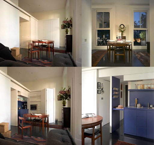
300 square feet seems incredibly small, but the way this tiny studio is arranged it seems three times as big. The kitchen is especially notable, as doors unfold to reveal hidden compartments and storage space, as well as a sliding counter that extends for food preparation. The bright blue on the interior kitchen area is an incredibly smart touch, as it adds to the whole jewelry box concept.

“My studio has been transformed into a flexible living space which allows me to work, sleep, eat, and relax within the confines of 300 square feet…The concept of a jewelry box has been expanded so that the space can be transformed through pushing, pulling, sliding, opening and closing of individual elements of the cabinetry. The rubber floor creates a seamless look that leads one’s gaze through the windows into the garden square below. I have a hidden stairway and secret compartment. I think it rocks. I am now broke. –Mia, the London Urchin via AT

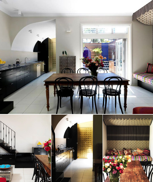
architect: Jennifer Beningfield of Open Studio Architects (more photos and project description shown here.)

for more photos and the complete posting go here.
[via AT]

Cutler Townhouse Bathroom

In the Cutler Townhouse by Murdock Young Architects there seems to be a rug on the wall. At first, I had a distinct ‘ew’ response, but after looking at it for a little while, it seems to be growing on me. Maybe the green texture has more of a living wall look? Whether you like rug-on-a-wall idea or not, the application of such a distinct texture on a smaller area certainly adds a lot of interest, so it’s something to think about if you want to kick up your space a notch.

See it here.

Paris Loft (plywood)

More plywood? Yes, please. This loft is an excellent example of utilizing plywood as a finishing element. Also, Remodelista posted this kitchen a while back and linked to a video showing how the islands can be rearranged to fit the homeowner’s needs. It’s a great idea for making the most out of a smaller space. To see the video, go here.

Renovated by architects Karine Chartier and Thomas Corbasson (who trained in the studio of Jean Nouvel–last year’s Pritzker Award winner), the old industrial laboratory (check out the building’s original freight elevator below) is transformed by adding a heavy textual and uncanny element–plywood.
Plywood, a moisture-proof, marine-grade, very low formaldehyde-content pine, certified by the European sustainable forest practices agreement, becomes a strong, almost abnormal complement to what would normally be simply a white, industrial space. It’s hard to see but the plywood kitchen islands are mostly on locking wheels, which creates a flexible space that can mutate from a small cooking area to a larger gathering area. Combined with the other moveable furniture, plywood has stopped looking cheap, and starts looking high-end (or high-grade, maybe?) whether it just sits pretty or on wheels. – LoftLife Magazine

To see more pics, visit LoftLife Magazine.

FMD Architects, Mirrored Island

Also seen in Vogue Australia Living was this rather interesting mirror-faceted island bench. A simple setting of white laminate joinery with mirrors (if I was attempting to do that myself I’d certainly not call it simple) makes for a focal point in this lovely white room. To see a close-up of the island, go here.

See the complete project here.

Unpainted Stair Runner

You might have seen this idea before, but to those of you who haven’t, how good does this unpainted stair runner look? I think it adds interest to the all-white interior, and makes sense as far as wear and tear.

AT did a post on painted stair runners discussing options and durability issues. Be sure to check their comments for reader suggestions.

(Forgive me for not including the source on this photo; I can’t remember where I found it.)